From a trusted name to a brand with clear direction and measurable impact
From tradition to future
Smeva has been providing refrigeration solutions for over a century, serving supermarkets, fuel stations and the healthcare sector. Despite its strong market position, there was a growing sense within the company that the brand no longer offered clear direction. The organisation was evolving, but the brand had yet to catch up. This created fragmentation in communication, both internally and externally.
One team, shared responsibility
Smeva wanted to regain control over its brand and digital identity. In a collaborative process where strategy, design and technology worked together from the start, we co-created a sharper positioning and a digital platform that truly serves users. At the heart of this was the GI methodology, guiding every step from uncovering brand insight to activating the brand in a digital context.
Bringing the right internal and external expertise to the table right away ensures that you can examine the question and its corresponding solution from multiple perspectives.
Brand strategy as foundation
In a brand session with Smeva’s core team, we mapped out the tensions and opportunities within the brand. We did not start with visible assets but with the story behind the brand. What makes Smeva distinctive, relevant and credible in a shifting market
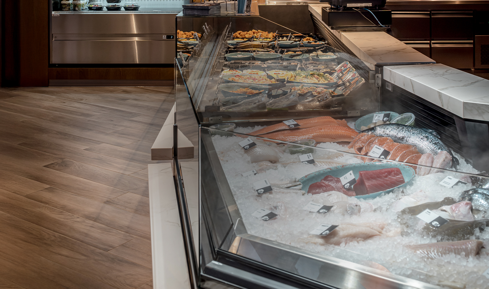
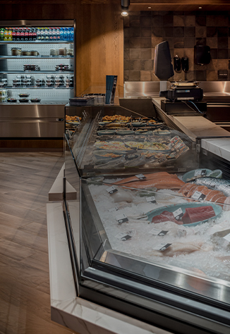
The essence was captured in one clear principle: Dedicated to Freshness. Not a slogan, but a compass for all decisions that followed, from language and tone of voice to design and interaction.

A digital translation based on user needs
The digital experience was built from the perspective of the user. We worked with personas and user stories to structure the site around context and need rather than internal logic. The site architecture reflects this layered approach
• Product level – direct access to solutions
• Market level – clear pathways per sector
• Brand layer – the story behind the company
This structure allows users to navigate quickly and meaningfully without distractions. Content follows strategy, not the other way around.
Design as the carrier of identity
The visual identity was refined based on the renewed brand story. The style is clear and distinctive, with high-contrast colours that support the brand promise of freshness and reliability. The goal was not to surprise but to offer recognition and guide every touchpoint with consistency.

From this insight, we got to work on the wireframes and the creation of an extensive UI toolkit. The primary goal of the website is to encourage contact, so: a conversion-driven site where a mobile-first approach is essential. Together with Not on Paper, we built a solid foundation, after which our designers took over to craft the visual translation.


Mobile-first puts the mobile user at the center and forces you to optimise the user experience accordingly.
A fresh look, for maximum conversion
From the UX phase, our designers got to work aligning the website with the brand essence, Dedicated to freshness. We chose black as the base colour. Probably not what you’d expect when thinking of freshness, right? However, the contrast with black makes the products stand out, which emphasises their freshness even more. By combining this with fresh teal and white highlights, we created a unique style (and matching vibe) that’s unlike any competitor. And it fits Smeva like a glove!
Outcome: more than a new website
The website was developed by Not on Paper, translating the strategy and brand into a seamless digital experience. Following launch, the brand grew not only in recognition but also in effectiveness. User engagement on the site changed measurably. More page views. Longer visit durations. Lower bounce rates.
More importantly, the digital environment now actively supports Smeva’s commercial and communication goals. The brand is alive within the organisation and connects clearly to the world outside.
Want to know more
about this case?
Got questions after reading the case? Or feeling inspired to start something similar? Let us know via the form below!
Thanks for your message!
We'll get back to you as soon as we can.